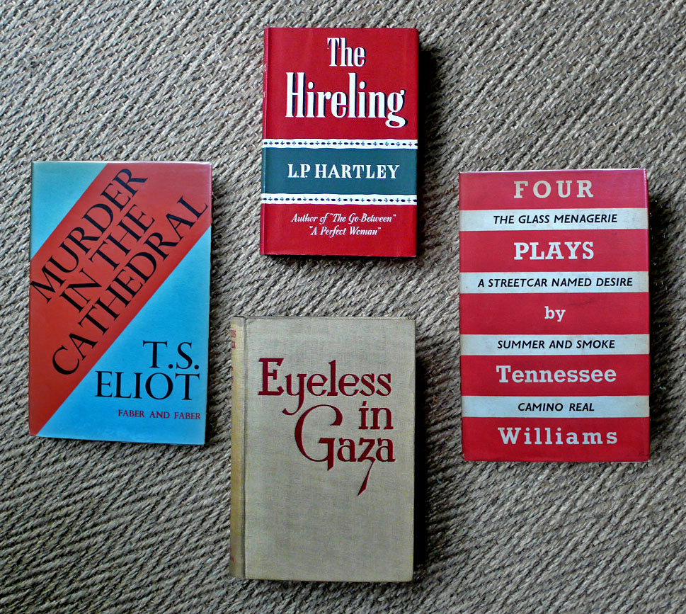
Some perfect ‘text only’ dustwrappers, two from the 1950s (The Hireling and Four Plays by Tennessee Williams) and two from the 1930s. Aldous Huxley’s Eyeless in Gaza is particularly dramatic – a lot of care has gone into the arrangement of that text. Such is the impact, it asks to be writ large on a film screen. I could stare at this font for hours (well, maybe a good few minutes from time to time…)
The Murder in the Cathedral dustwrapper does something quite subtle: it suggests a cathedral with a simple serif font reminiscent of stone lettering on a monument, but the diagonal slash of red shouts of scandal like a newspaper headline.


I do like a good font! Have you read that book Just My Type?
I’ve seen that book a lot and been on verge of getting it – it always seems to be when I’m trying to abstain from more books (a fleeting state I have to say)… I missed something here what with the cathedral and the font, there was a much better heading somewhere!
You know, I think you’ve made me look differently at text only covers with this post – led me to take a closer, analytical note of the design and the cohesion of the overall effect. I think it’s often the case with me that when the design or font isn’t right, then it really jumps out at me as…well… wrong! Some fonts can be so ugly or clumsy, or misplaced etc. But when it all works, the harmony kind of reaches a subliminal place and just feels…well…right! And I don’t think I’ve really considered it too much before, beyond instinctively reacting to its rightness … But it has been eye-opening, after reading this post, to look along my shelves and think more precisely about why I love certain covers. Picking out the ones that truly draw me towards them, I realised how much the font and placement/ colour of the text etc is a big factor. Thanks for that. (Love the idea of the cathedral and the font!)
Many thanks too for your wonderful comment over on my blog. So much in that has further inspired! The clock has stolen my chances today to write the reply I’d like to (will sit down in a calmer moment tomorrow and add my thoughts then…)
Fonts are fascinating things – they really have personalities I think, or a particular sound if you know what I mean, like major or minor! Good to see dustwrappers based around text being popular again.